SET’s School of Emerging Technologies is a revolution in the education format by introducing and guiding the current generation about the futuristic approach of emerging technologies that will be more and more based on Information. The broader spectrum of these studies covers the Internet of things, Extended Reality, Data Science, Artificial Intelligence, Cyber Security, Data analytics, and much more. SET is a Singapore-based educational institute that collaborated with North Cap University, Gurugram, to set up and start technical courses in India. In addition, we were responsible for branding and advertising promotional support.
BRAND’S FIRST IMPRESSION
When you think of identity that turns out to be a brand later, you think of a logo. The logo is the first thing that comes directly to anyone’s mind; this is the reason it should be attractive, appealing & elegant. With all these factors in mind, it also should signify the proper communication of what the brand stands for. Our first task was to design a new identity logo for SET, The brief was straight; their name ‘School of Emerging Technologies’ should clearly reflect on the design. After a few days of research, brainstorming and multiple sketches, we came up with 4 design options out of which this was finalized and appreciated a lot. The tagline ‘Skill Up Move Up’ made the logo more interactive and recognizable.


A STRONG IDENTITY STRENGTHENS THE BRAND
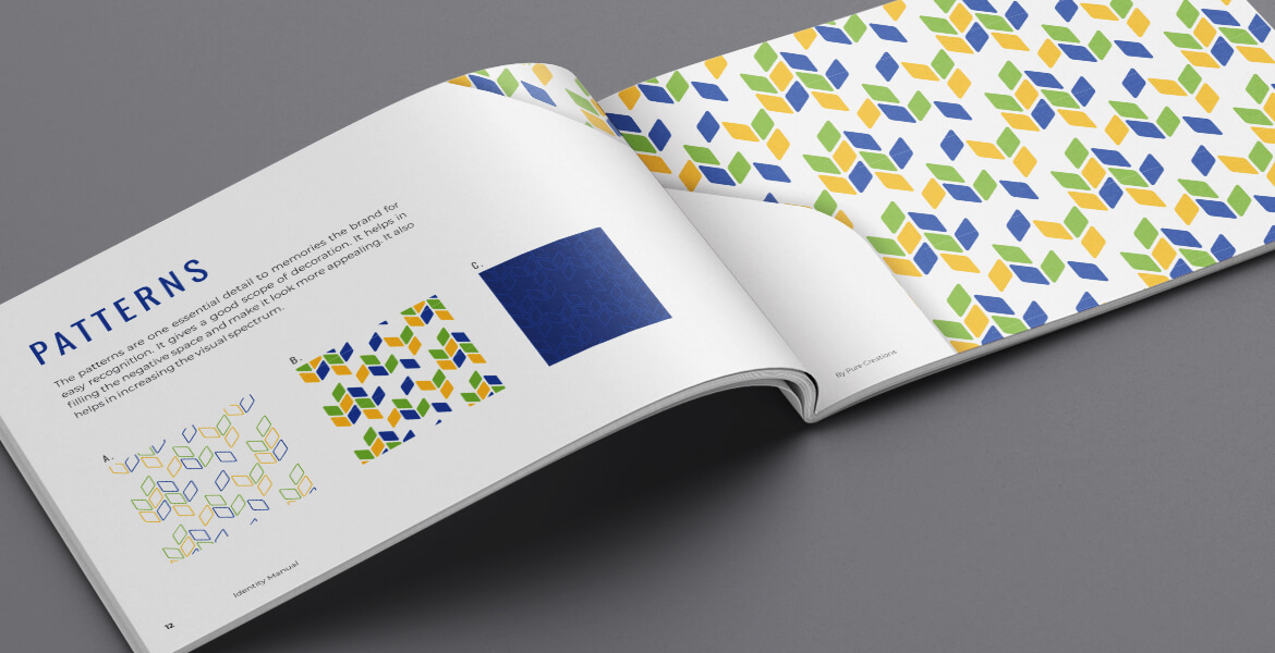
The secondary input that we were allocated as the immediate requirement after the logo was the stationery and flyer design for the marketing team. Once we were set with the logo and brand identical color scheme, we created beautiful patterns that made it straightforward to communicate with singular perspectives through different mediums.

YOUR FIRST WORD SAYS IT ALL
The first communication design had to be ready for initial communication. Then, we had to present the brand in the market powerfully; therefore, we connected the brand with the future as the word ‘future’ gives us a lot of hope and inspiration to work hard. Our headline/copy said it all – Don’t be the history when you can be the future. Then the visual added all the correct elements to accomplish the goal.
THE RULE BOOK
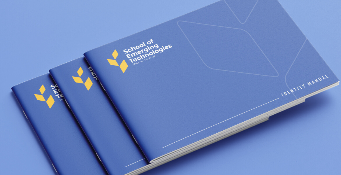
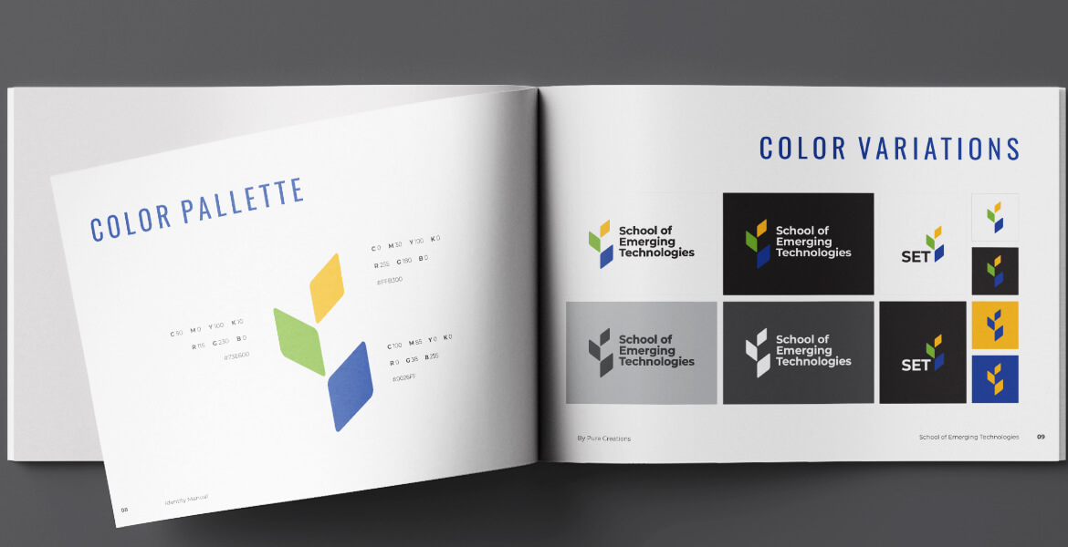
When you present yourself as a brand, one must have the discipline to carry it further. Brand Manual book is one basic mandatory guideline to have with you so you can follow the right channel and don’t get distracted from what the brand initially spoke for. It gives you a set of rules to present yourself in a proper manner without losing your brand image.
THE DREAMER’S SPACE
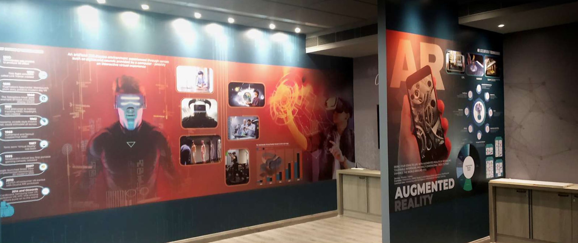
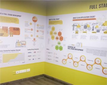
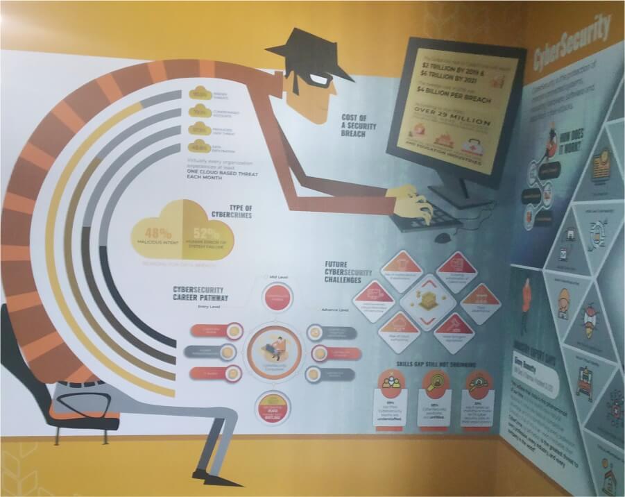
The next big challenge was designing walls for the entire space of the institution with 11 different verticals, including the classes, labs, walk-through areas, etc. There were around 48 walls with some pass-through areas and galleries. After a full proof recce and measurement of the areas, we separated the sections with the colours, whereas designing themes had to be the same using patterns, shapes, and infographics. This whole exercise took two months of hard work for our team to complete.
THE CHANGE
The overall branding and the new unique look of the office/space carried more than expected footfalls to the campus. Our cleverly designed promotional advertising stands out in communicating with young minds and made a good approach in getting an ample number of admissions for the session as well.


