The name “Peccanos” has inspired and derived from the word Pecane in French, which later became Pecan as an Algonquian word variously referring to pecans, a species of hickory trees. Pecan contains an edible kernel and can easily be recognizable by its smooth pinkish-brown distinctive grooved surface and similarity to a walnut.
The individualistic stature of Peccanos has been built upon more than 50 years of hands-on experience and skills with a strong presence in the market. The company procures and supplies products from over 10 countries. We make sure that our clients get to know the flavors of India in an exquisite manner, through our products.
BASIC DESIGN ELEMENTS
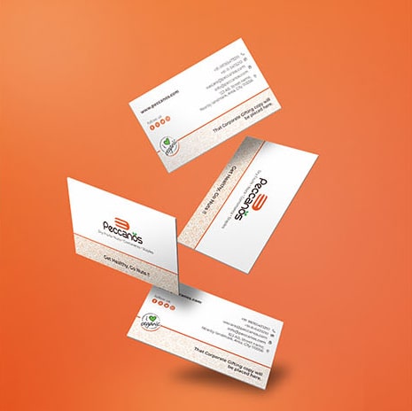
As Peecanos was hitting it off to step in the market with their products, the client was concerned regarding the clarity in designing stationery. We decided to develop elegant design elements first so that we could use them for future assignments too. Patterns and other basic shapes were created according to the theme decided. Same patterns were put into the stationery design which came out meaningful and creative.
IMPRESSIVE PACKAGING SELLS YOUR PRODUCT
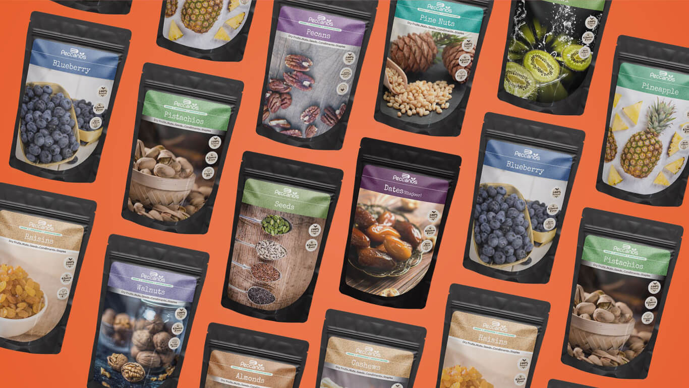
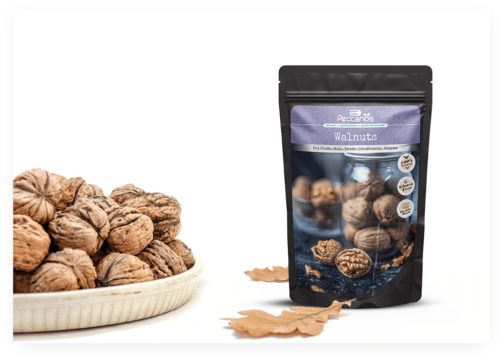
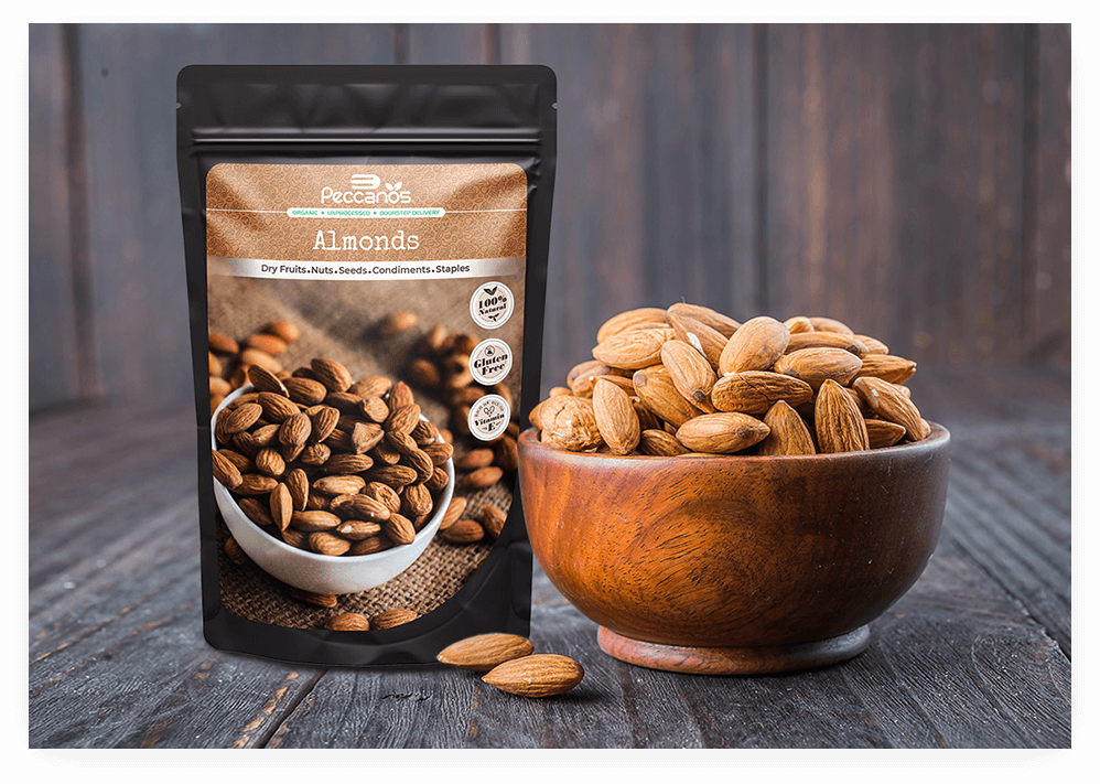
In this new digital era where many new products appear in front of you, It has become very important to give your product a very attractive look. A customer at least tries the product once if your product has a cool look, the rest depends on the quality. We had an opportunity of designing product packaging so we planned it accordingly and designed a decent layout after a lot of revisions. The use of patterns, images, and texts was so balanced that the client liked the final design a lot. The next task was to follow the design for the rest of the products, and the final result came out amazing.
GOOD MARKETING FEELS MORE LIKE A CONVERSATION
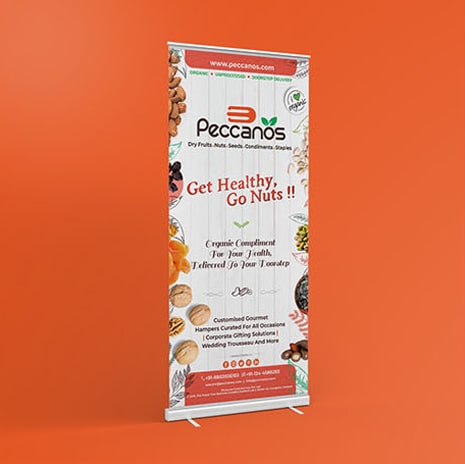
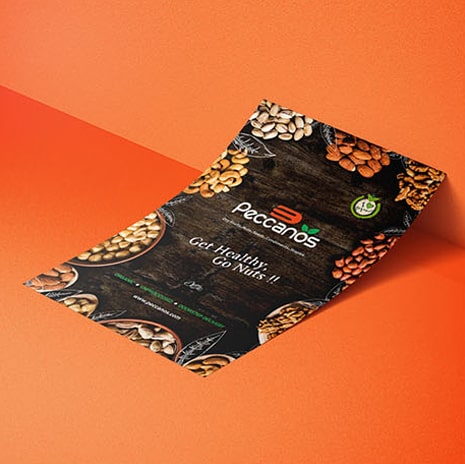
After creating successfully the best packaging design, the next task was to create marketing collateral to sell the product. Target was straight & direct to sell the quality. Creative Posters, flyers design, and standees were developed for the same. After the discussion with the client, the campaign line was decided; “Get Healthy, Go nuts”.
FILLING DETAILS BRING ON CUSTOMERS.
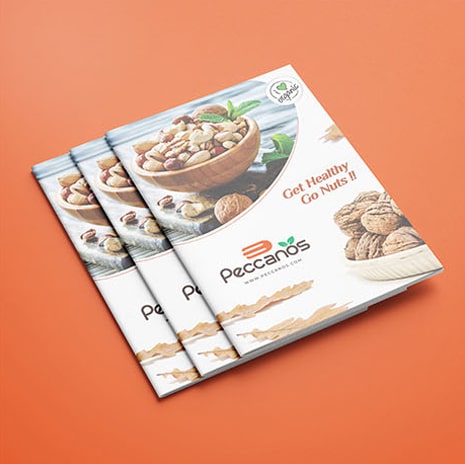
Having a great product catalog is one of the most important things that work for a brand in the long run and ease their way to tell everything again. A customer can have detailed knowledge about the product and it helps to build trust in the product. More knowledge about the product and brand can develop good brand value.
A lot of research was involved in this project as we had to read a lot about all the benefits, advantages, etc. After collecting a pile of all the details and content, a decent & smart layout was developed. As it got approved from the client’s end we were ready with the catalog in our hands in no time.


